Microsoft is looking to do something more cool with Windows 10 start screen and app list for Windows 10 Tablet devices. We recently reported that Microsoft is planning to launch Windows 10 Anniversary aka Windows 10 Redstone later this summer.
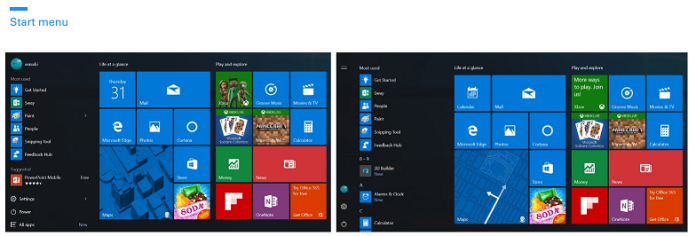
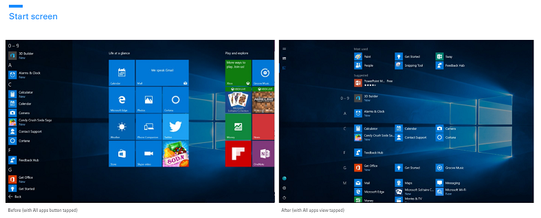
Now, Microsoft is looking to make some UI and UX improvements in Windows 10 (Tablet Mode) Start Screen. A new Quest in the Feedback Hub has been published by Microsoft, the Quest talks about an much improved all app list in start screen, have a look at this screenshots.
The screenshots reveals some minor changes in startscreen’s UI. The changes are quite useful for touch screened based Windows 10 Devices.
Microsoft stated:
You saw a sneak peak of our vision in the Build 2016 sizzle video, and we’re excited to show you more. Our goal with these changes is to simplify and make your most common tasks take fewer steps. Here’s what we’re thinking:
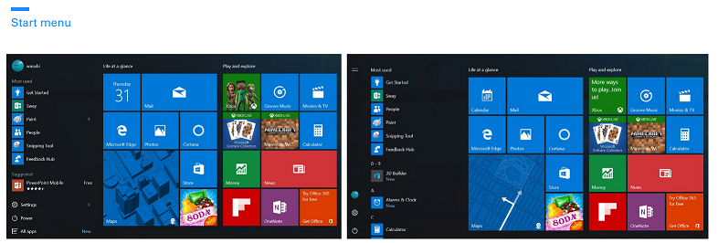
Start menu: This view is predominantly designed for PC. We’ve heard your feedback, and we’ve focused on consistency, efficiency, simplicity, and making better use of the space.
The All apps list is essential to understanding which apps you have on your device. We’ve elevated this list to the top level of the UI to reduce clicking & scrolling. This makes it easier to access apps in the All Apps list. It also reinforces the consistent Start experience across form factors.
Start screen: This view is predominantly designed for tablet. We’ve heard from Insiders that they feel Windows 8.1 start screen delivered a better tablet experience than what we have in Windows 10 today. We are addressing that and are looking to make the All apps list more usable in two ways:
- Full-screen All apps list in tablet mode. We heard your feedback that the All apps list should be full-screen in tablet mode and explored several designs that aid efficiency while taking advantage of the additional real estate when Start is full screen. Specifically, we’re striking a balance between density and “scan-ability” (i.e. how easy it is to scan the list to find the app you want).
- A combined “Most used” and “All apps” list view. With this approach, we hope to address the confusion that many users felt with the two very similar list views (“Most Used” and “All apps”).
As part of this improvement, we’ve also made it easier and more clear how to switch between the “Pinned Tiles” and “All apps” views by adopting the navigation pane pattern used throughout Windows.
What do our readers think about it? Do let us know in comments below.

