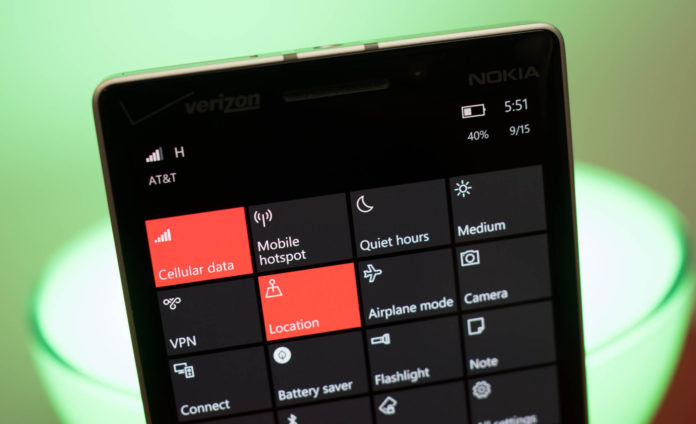
When Microsoft introduced the Action Center in Windows Phone 8.1, it was widely applauded and well-received. With Windows 10, the action center was further modified and polished and the change was welcomed by all. Now, a recent leak shows that Microsoft isn’t done with the Action Center changes.
A new leak shows that notifications in the action center will have their corresponding app icons right beside them as well as being present in the header. There are supposed to be a few minor tweaks too and also a revamped WiFi settings page(which we reported a few days back).
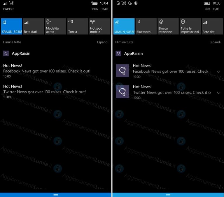 Side by side comparison of the current(left) and new(right) action center.
Though this change is not as exciting as the fans want(which is a transparent action center), it’s good to see Microsoft being dedicated towards its mobile OS. Are you glad of this change or do you think it’s ugly? Tell us in the comments section and don’t forget to use the Feedback Hub app to send your suggestions, who knows we may also get something more exciting soon!


