Our sources previously confirmed Microsoft is working on a significant revamp for Windows 11’s File Explorer. The tech giant later suggested this in a Windows Insider webcast. The company confirmed it is moving File Explorer to WinAppSDK (Windows App SDK), enabling WinUI, new APIs and other features.
Based on sources, leaks and references in Windows 11 preview builds, here’s what we know about the new File Explorer upgrade:
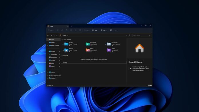
- Redesigned header with a modern file directory box, search box, and home button.
- Integration with Microsoft 365 for recommended files and deeper file details.
- Updated left-side navigation and details pane for a richer experience.
- New “Gallery” area for a more enhanced photo viewing experience.
- Future Windows 11 versions may have a whole new File Explorer with better performance and more web integration.
File Explorer on Windows 11 could see the most significant update in the fall. This would be the biggest update to the file manager in a decade and could change how you use it, with our sources hinting at web integration and deeper integration of Microsoft 365 in the final version.
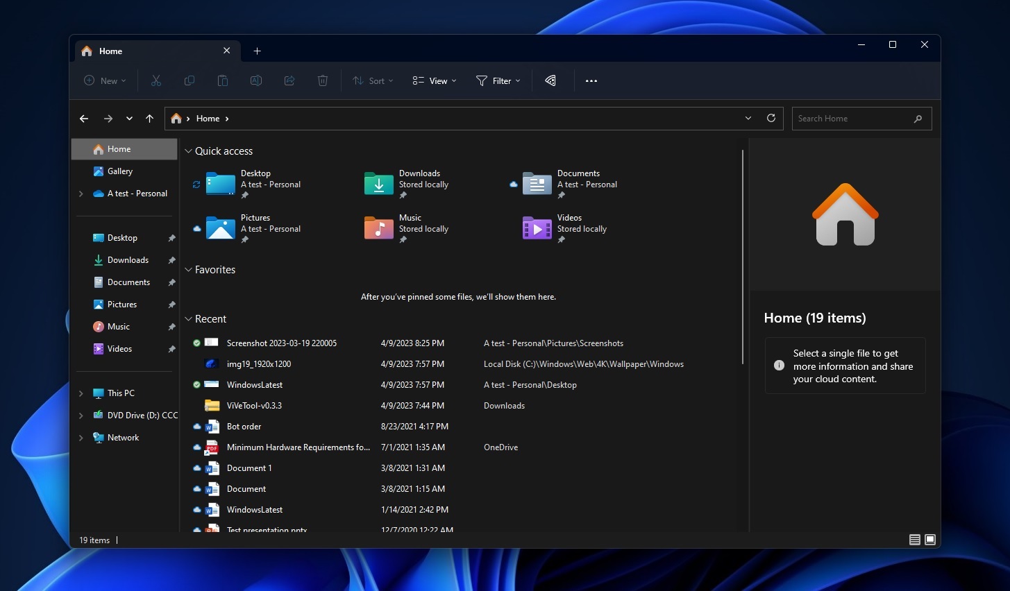
So what’s new in new File Explorer? First, File Explorer’s “home” is getting Microsoft 365 integration, and it will offer recommendations from your organization under the “recommended” files section. These recommendations will feature large thumbnails so you can easily see the files.
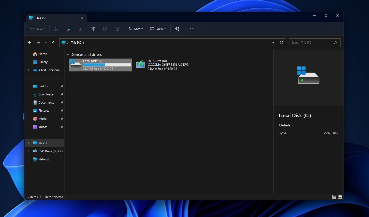
Second, Microsoft is updating the header and moving options like “New” or “Copy” to the file/folder view, available below the header. This reduces clutter and leaves space for search box features, which are also being updated with faster results and modern design.
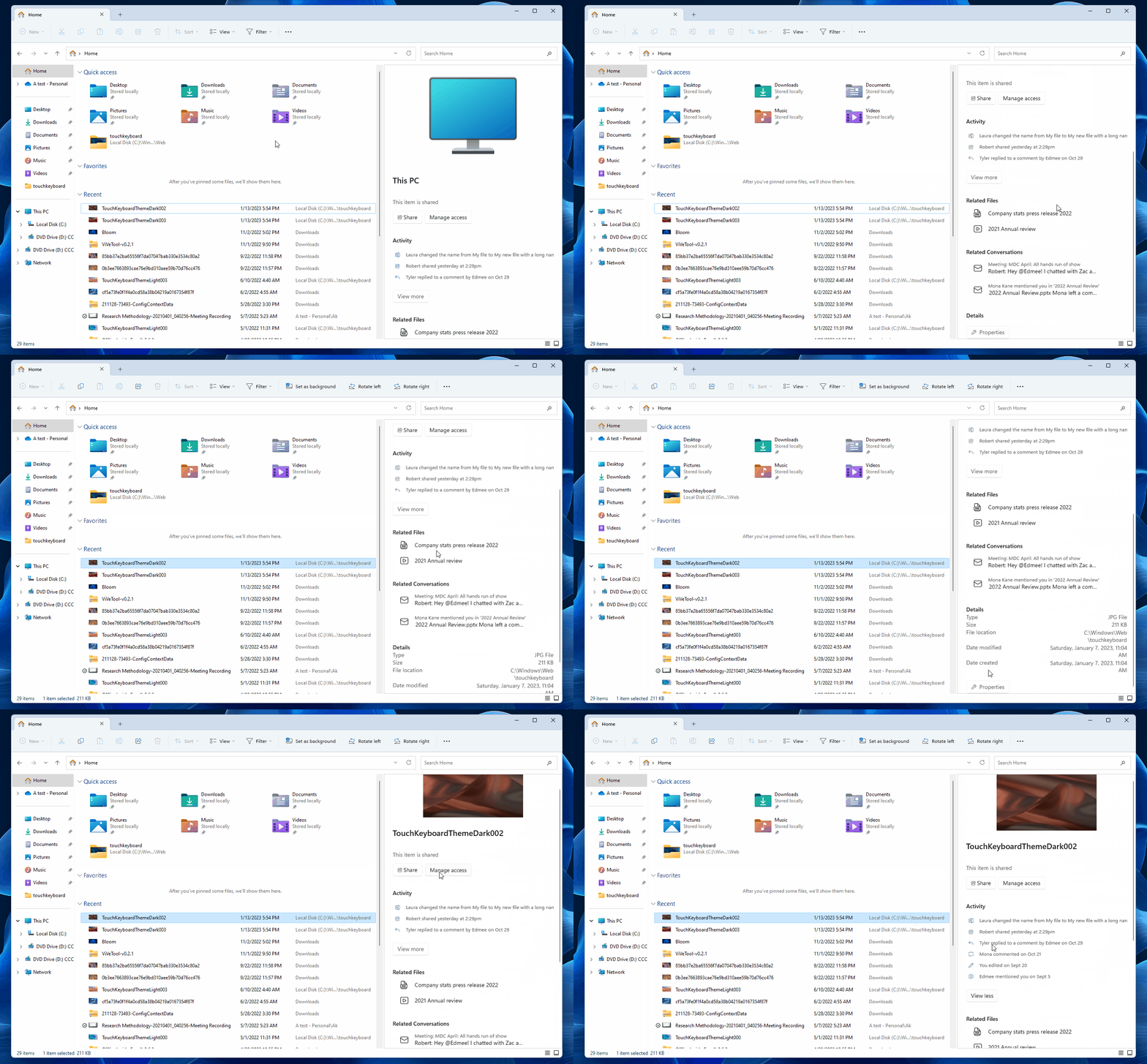
File Explorer is getting an updated “details” pane that is more touch-friendly and Microsoft 365-powered, unlocking new user opportunities. Thanks to Microsoft 365 integration, you can see emails, threads, comments, tags and more details about files shared in the organization directly within File Explorer.
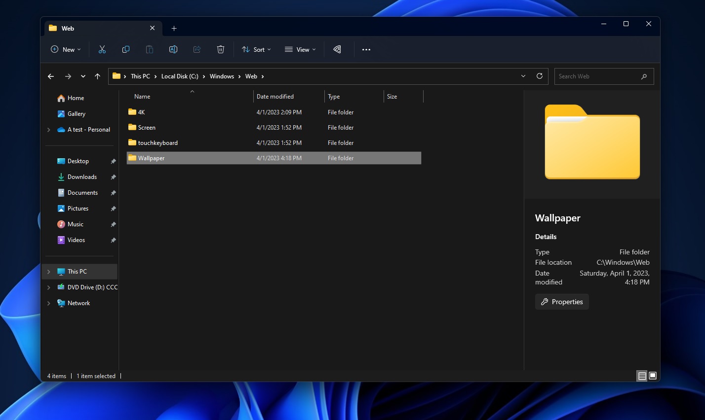
Another significant change is the new “Gallery view”. This new gallery view uses XAML and shows images from your computer in an attractive format, similar to modern Windows 11 apps.
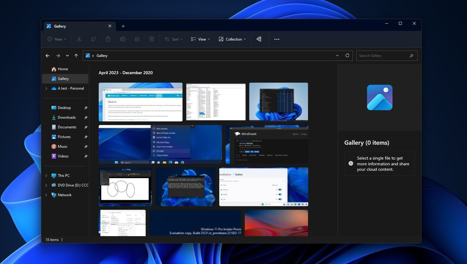
When you click the Gallery button below “Home”, it will automatically show a series of pictures from the Picture folder, and everything is sorted by the date. You can click on the image, and details will automatically appear on the right in the details pane.
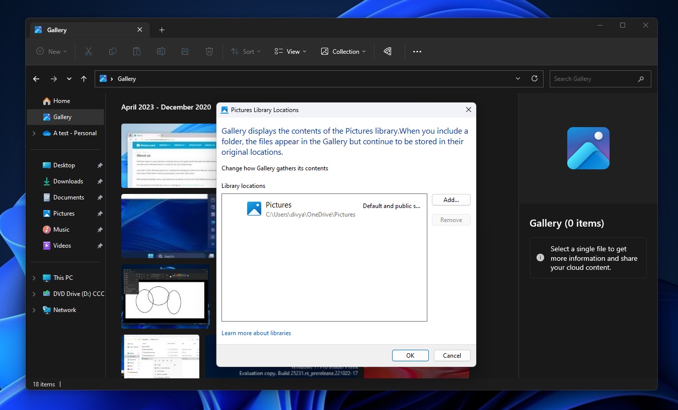
Search is pretty basic and doesn’t work most of the time, as it can look up pictures by filename only, which isn’t very helpful.
If you’re unable to find your pictures, there’s a new dropdown for the “Collections” that lets you choose which locations you want to show images from
Conclusion: New File Explorer design looks promises, but it’s not ready for primetime
Overall, the updated File Explorer app looks promising with its modern design and integration with Microsoft 365. It features a revamped header with a file directory box, a search box, a home button, and a new details pane with rounded buttons.
The app also integrates with Microsoft 365, showing more file details and allowing users to access email threads and comments related to shared files. A new Gallery area lets users view photos in the app, and file tagging may be added.
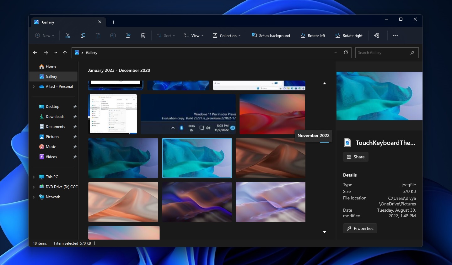
The gallery feature is still unstable, but it suggests that File Explorer may get more updates in the next Windows 11 release. These changes make File Explorer more user-friendly, especially for touch devices, and enhance its performance for frequent users.


